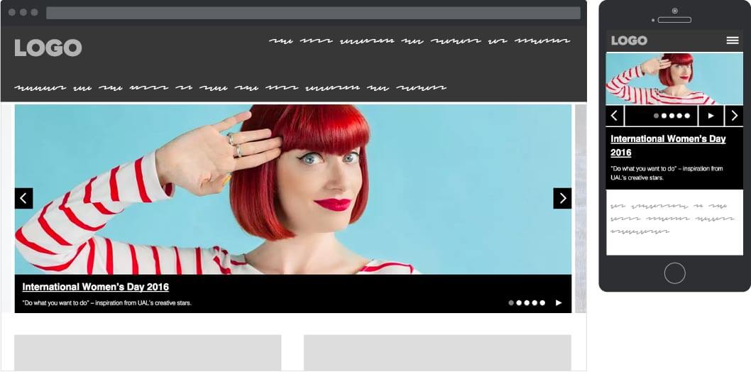
Slider carousel
The slider component was designed as a feature component to be used on key landing page and provide a more visual deep linking way to certain types of content. Initially we tried to restrict its usage on the site as much as possible. Research has shown users tend not to interact with the controls unless there is a clear information scent and they can deduce what types of content are being linked through.
Inevitably restrictions on what types of content should go in it were met with stakeholder resistance. Due to its visual prominence, the component was creating the illusion of higher content visibility and it was used as a tool to satisfy multiple stakeholder groups.
Landing page width slider
The slider component has 3 different widths depending on context, inherited automatically based on its placement when building a page in the CMS:
Landing page width - used on the home page
Feature width - used on landing pages
Content width - used on content pages with the ability to have an aside element
Sketches and notes
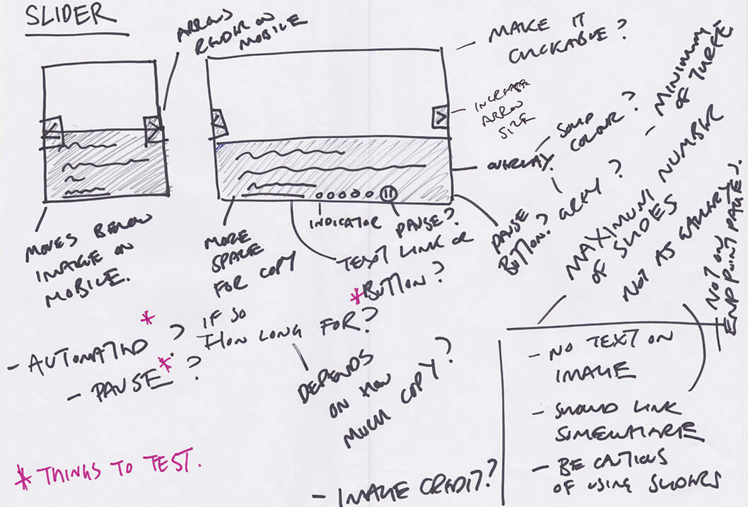
- Controls render on mobile
- Text moves bellow image on mobile
- More space for copy
- Minimum & maximum number of slides
- Mandatory link per slide
Wireframes

Film strip carousel
The film strip component was designed to address space issues when there was a need to display multiple deep links in the same section.
Instead of stacking the images and links vertically, the component aligns them horizontally, hiding any extra ones off the edge of the page container.
Feature width film strip
The film strip component has 2 different widths depending on context, inherited automatically based on its placement when building a page in the CMS:
Landing page width - used on college landing pages
Feature width - used on section landing pages

Film strip sketches & notes
- Framed?
- View all button
- Image credit?
- Image clickable?
- Arrows outside?
- Headings links?
- Image heights?

Film strip updated styles
The film strip carousel was mainly used as a feed for news and events on the site. The information was fed through wordpress and salesforce respectively. As the process was automated, there was no control over the image crop showing in the component. This sometimes resulted in strange crops. To mitigate the issue we further revised the component to accommodate variable height images.
