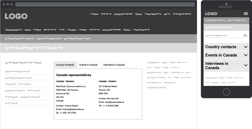
Tabs
Similar to accordions, the tab component was designed to provide economy of space, but unlike accordions, the content were not meant to be read in sequence.
Due to the site being responsive and the content fluid, the tab component was restricted to a maximum of three tabs, all with character limits. At the lower breakpoints the tabs convert to accordions for better use of the space.
Tab placement